
Card sorting, what is it? How does it work?

Today we’re going to talk about how card sorting can help you make meaningful changes to the flow of your website – I’ll take you through why using a card sort can be useful for navigation, what different types of card sorts you can run, and how to use analytics to act on your research.
So first, let’s talk about information architecture and navigation!
For those of you who may be new to Information Architecture (IA), or need a refresher, IA is sort of like the skeleton of a website – when and where do you show a person a certain piece of content? Giving the user all of the content all at once can be very overwhelming, but it can also be difficult for a user to go through multiple submenus to find the thing they are looking for. So building a site map, where you list out every webpage and how it connects to each other, and building a great navigation system helps make your website more usable.
However, that is just one part of it: when a user visits your website, they do not want to click around to find the things that they need – they want to find what they are looking for right away. According to Nielsen Norman Group: “…users leave many sites feeling that the content/functionality was not what they wanted and they experience friction because of poor organization, structure and/or nomenclature.” (Link) Ideally, you want users to find the content they need with the fewest amount of clicks, and improving IA helps make the navigation more intuitive to achieve that goal. Investing time in making sure your site navigation is easy to understand and fluid with your content can ensure you are retaining users as they scroll through.
How do you determine if your navigation works, or your content is easy to find?
This is where user research can come in handy! You can always run more qualitative studies to get in depth on how a person is thinking and doing the motions, but one of the easiest ways to get a top down view of your audience is by running a quantitative study, like a card sort!
A card sort is an exercise where you will ask participants to sort a list of things (cards) into either predetermined categories or categories that they create. This is a great exercise to run while you are building or revamping your navigation flow, and it can also be helpful when you want to test if your site is already organized correctly.
A successful card sort should give you insight into how your participants are thinking and interacting with the content you are providing. By doing this exercise you can notice patterns and make changes by analyzing where items are most frequently sorted, and it can give you a great launching off point to get started on your navigation design flow. There are 3 different versions of a card sort study you can run, and each are helpful in different ways:
- The first is an Open Card Sort – in this test, you put the control into the hands of the participants – they will both create the categories themselves, and then sort the cards into those categories. This test is really great for designers wanting to start from scratch, and I usually recommend doing this early in the design process as this will give you sort of a baseline of how users organize your content. Even with participants giving their unique perspective on each category, it is not surprising to see similarities come up throughout the results!
- The second is a Closed Card Sort – in this test, you take more control by listing predetermined categories and asking participants to sort into them. Often I see researchers use this type of test later in the stages of the development process, when they have the categories determined but want to ensure the users are on the same page. Other researchers like to use this type of test to find improvements that can be made in a current navigation flow – there are lots of different ways you can implement closed card sorts in your research!
- The third is a Hybrid Card Sort – in this test, the researcher defines the cards and categories, but allows the participant to create categories if they need to. As the sort of “Goldilocks” option, this type of card sort is great in all different stages of the design process – as you come up with ideas for a new navigation flow early in development, you can see how users react to your created categories while allowing outside-the-box solutions. If you are later in the design phase or development phase, you can utilize a hybrid to test if your categories are working as intended or if there are any changes to be made.
The number of participants you want to recruit for a card sort is going to be a lot more than you would recruit for a moderated or unmoderated study. Since we are looking for more of a general overview of how participants move through the study, we want to collect a lot of data vs more quality answers. So for a card sort, the industry standard is roughly between 15-30 participants (1, 2).
Let’s say I am an electronic retailer, and I want to start selling different electronics online. I want my navigation to be easy to find all the things people want, and I have a general idea of where someone might sort some of the more common items I sell, but I’m still not quite sure about some of the less frequently sold items.
In the case of this example, since I know a little bit about how I might group some popular items, I would choose a Hybrid Card Sort – this will allow me to show some predetermined categories while also allowing room for individuals to create their own. An open card sort would also be ok in this case, however a hybrid allows me to test my ideas against their own as well.
In this video, you’ll be able to see how we set up a card sort study from start to finish on PlaybookUX – you will also be able to see how it looks from the participant’s perspective. Want to test one yourself? Click here to take a card sort study!
One question that comes up frequently is how many cards are too many to present to your participants at once? We start to see fatigue and drop off between about 25-30 cards, so it’s best to try and keep it less than that number. In addition to this, we recommend randomizing cards and categories to help reduce bias. As individuals get closer to the end of the study, they may sort cards into categories a little less thoughtfully than the ones shown to them earlier, so randomizing helps even out the playing field for your results.
Once you set up your card sort and receive responses back, you can start to use the data to help make meaningful decisions about how your website is organized. Let’s take a look at an example.
For this card sort, the participants were given a list of cards containing items that would be frequently found in grocery stores, for example apples, bananas, pizzas, peanut butter, etc. I asked participants to sort the cards into categories like they were putting items into the respective aisles of a grocery store. I can view each participant’s answers to the test in the participant tab, but for this type of test, the best way to view this data is collected all together, so the best results are located in the analytics section.
The analytics provided after a study is completed can help guide you into making changes to your navigation flow, and we break them down into a few different views that all have their respective benefits.
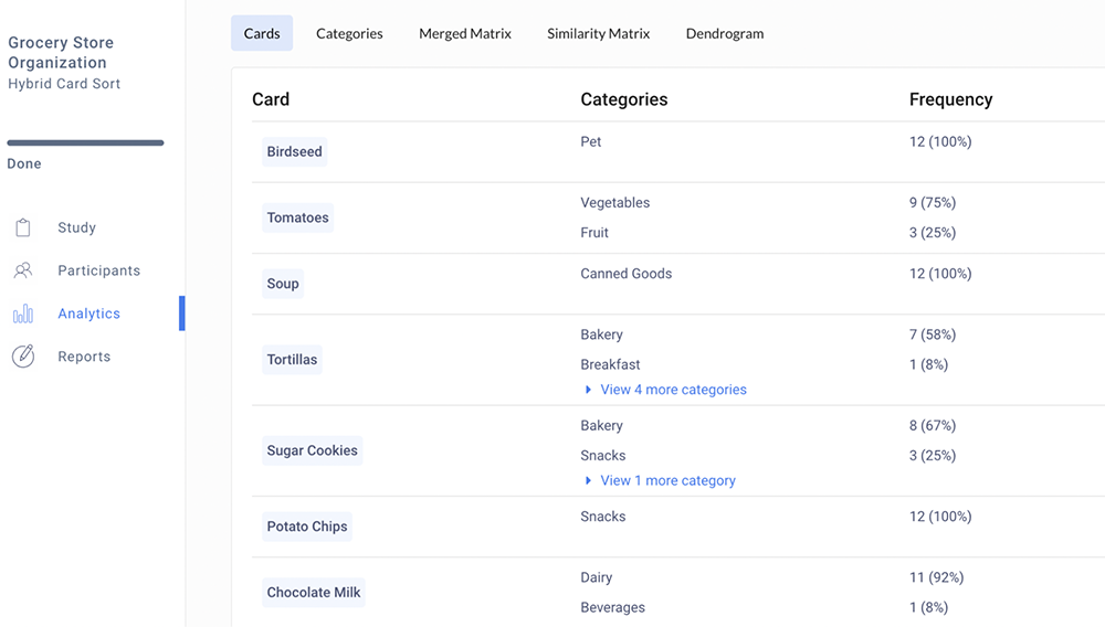
First, we can look at the cards themselves, and drill down into each item – where they were most frequently sorted. This is a helpful way to dig deeper into the items themselves to see how users interpreted the cards, which can lead into valuable insights on where certain items can be placed. You can see cards like Apple, which were almost exclusively put into one category, versus Waffle, which was spread over different categories, meaning there may be more than one place to put these items that are useful.
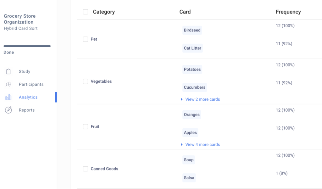
Next, we can dig deeper into categories – but you might notice something when you do an open or hybrid card sort. Because I let my participants name their own categories, there are most likely a lot of different categories listed here that may have similar names or are different terms for the same thing. A great example is the card “Wine” was sorted into categories like “Alcohol”, “Liquor,” “Beverages” – these are all very similar categories, just named a different thing for each of these individuals. So I can collapse all of these categories together by clicking “Merge Category” – this will help me pool together the data and exit out any category names that are redundant or misspelled.
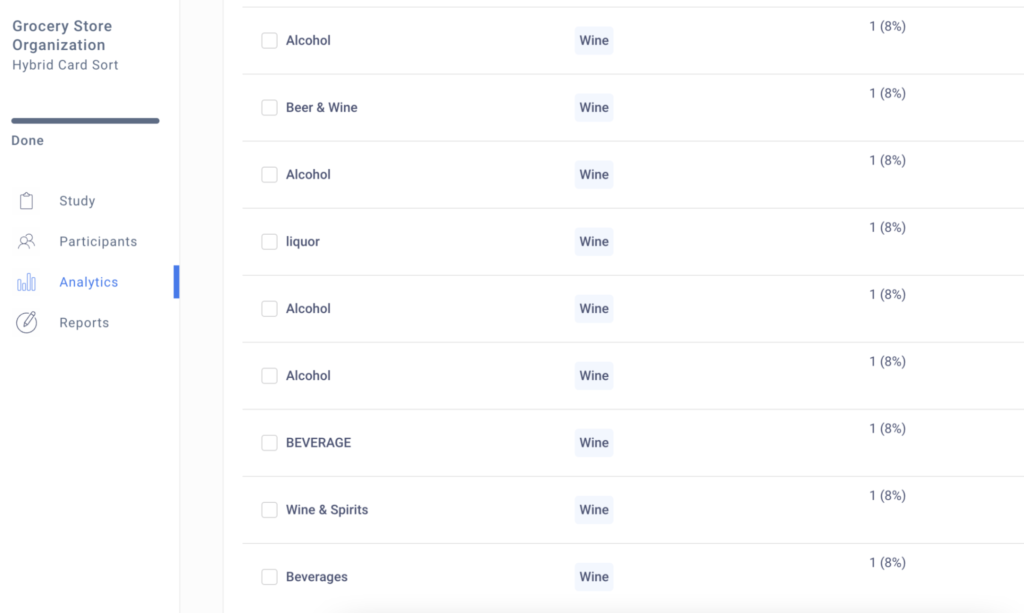
Now I can see all my data put together here, but upon second inspection, I do see that there is a difference between “Alcohol” and “Beverages”, as coffee and chocolate milk were sorted here as well, so I will unmerge the categories, and just merge the categories that are “Alcohol”-related together. Now my data feels more accurate and can help me understand the various categories I can use on my site. Alternatively, seeing what terms the different users created can spawn new ideas on how to name the various different categories included in a navigation flow. For example, 3 participants said “Alcohol” and 1 said “Liquor’, leading me to believe that “Alcohol” would be a more commonly used term in my navigation flow.
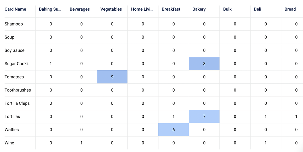
An even better way to look at the data as a whole is through the Merged Matrix – this view shows me all the cards here on the left and all the categories at the top, so I can see a top down view of how often the various cards were sorted into each category. The darker the color, the more times it was sorted into that category, so right away we can see things like apples going into fruit, pizzas going into frozen, mops going into household, etc. Already I know how I want to organize some of these items in my design based on the frequency it was sorted. You’ll also notice rows with multiple different color areas, these are cards that were sorted equally amongst different categories, which leads one to ask, how do I choose the correct category if everyone was split?
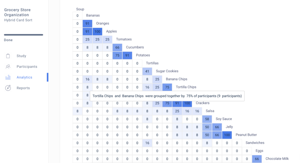
Great question! And one that can be answered by the third type of analytics: the similarity matrix. This graph shows how cards are grouped together – the closer in proximity, the more often they were grouped in the same category. Here, you can see patterns emerge that are not as clear in the previous analytics, which makes those harder-to-sort cards easier to visualize. For example, banana chips were sorted into a variety of categories (fruits, snacks, bulk, etc.) but seeing it here I can see that a large amount of people sorted banana chips and tortilla chips together, so I can safely say that sorting them in a category together would make sense for most participants!
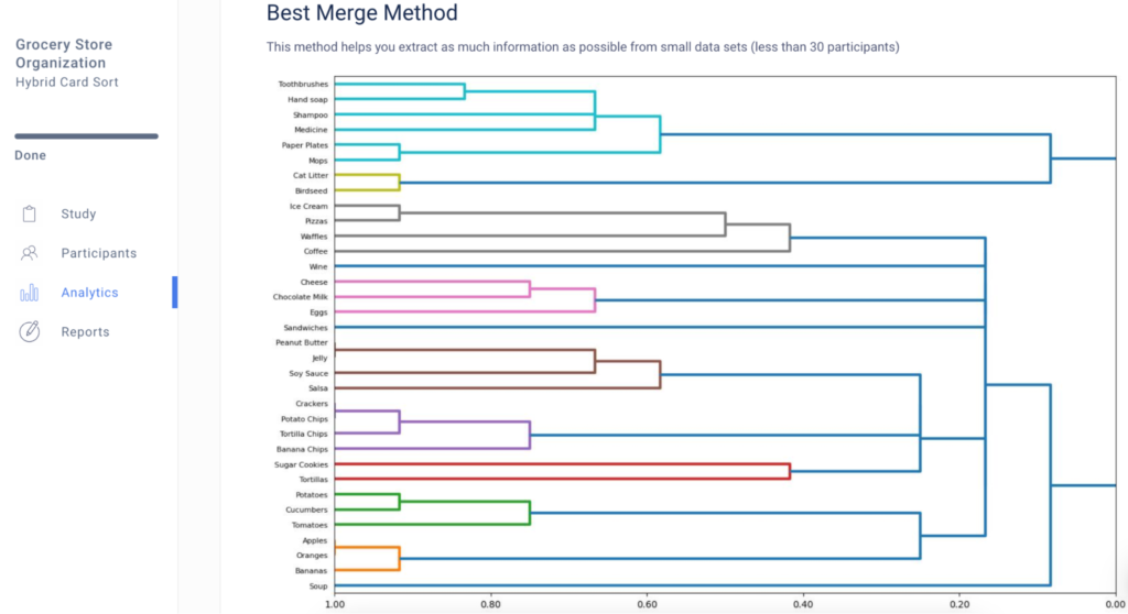
The dendrogram presents the same data but just in a more visual way – Here you can see the closer together the items are the more often they are grouped together.
So with just this card sort, I know what categories I want to include to make sure it is clear to customers, and I know how to sort my items in a way that is fairly universal to users. This is a great starting point for me to start working on my navigation, and I can always run another card sort further along in the process if I want to add more items to be sorted or check and make sure the process works.
Another type of quantitative research that is helpful is a tree test, which can be a great follow up test to run after a card sort in the later stages of development. This test allows you to build a navigation tree and provide the participant with tasks to see if they can find the correct answer, which helps ensure that users are understanding the flow of your site. Please feel free to reach out to our team if you have any questions on how to launch a tree test!
While most researchers use card sorts to work on navigation, there are many instances where card sorts can be used creatively, even within your team. We have seen researchers use closed card sorts as a ranking system: some examples you can use are having your design team sort upcoming initiatives by importance, or having participants sort information from a marketing email by importance (in both of these examples, the categories would be listed as Most important, least important, etc.). Feel free to explore different options and utilizations as you launch more studies!
So, now that you’ve gotten a taste of card sorting, let this test unlock that navigation structure for you and happy testing!
Speak to high quality people