
Using Heuristic Evaluation to Improve Usability

A heuristic evaluation, also known as an expert review, is a way to ensure your website is user friendly.

A heuristic evaluation is similar to user testing, but in user testing, the testers are users and in heuristic evaluations, the testers are usability experts. Heuristic evaluations should be conducted along side user testing early on in the software development lifecycle.
These usability experts are professionals who are skilled in determining heuristic evaluation criteria, and assessing a product against it. It is recommended that 3 usability professionals independently assess your product. However, startups can’t always afford to hire 3 usability experts, so you can perform what’s called a heuristic markup, which is when you perform the assessment yourself.
In order to perform a heuristic evaluation, the usability experts must:
- Choose the heuristic guidelines
- Define a rating system
- Choose a method for documentation
There are a list of 250+ qualitative guidelines to test against, however it’s safe to use Jakob Nielsen’s 10 Usability Heuristics as a starting point.
We’ll walk through some examples of the good and the bad.
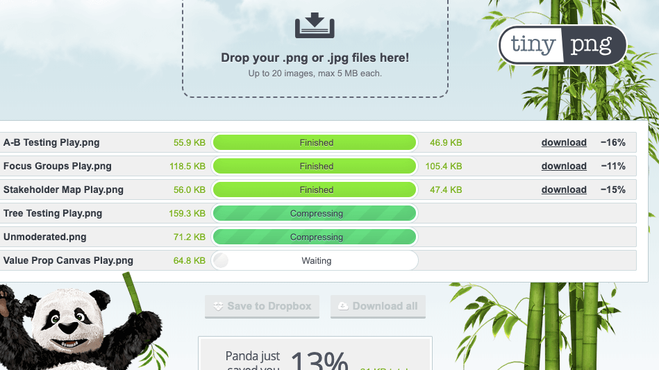
1. Visibility of system status
The system should keep users informed of what is going on. In this example, TinyPNG shows you that 3 pngs have been compressed, while 2 are in progress and 1 has not started yet.
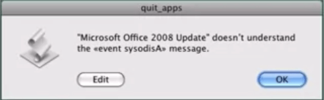
2. Match between the system and the real world
The system should use language that is easy for your target user to understand. This is extremely important for error messages. In the below example, Microsoft produced an error that humans simply can’t understand.
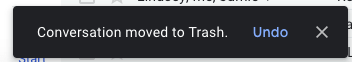
3. User control & Freedom
Users should be able to undo and redo actions, and also have the ability to move backwards. There should always be an emergency exit. Gmail allows you to “undo” actions. This is important since people make mistakes, and need the ability to correct those mistakes.
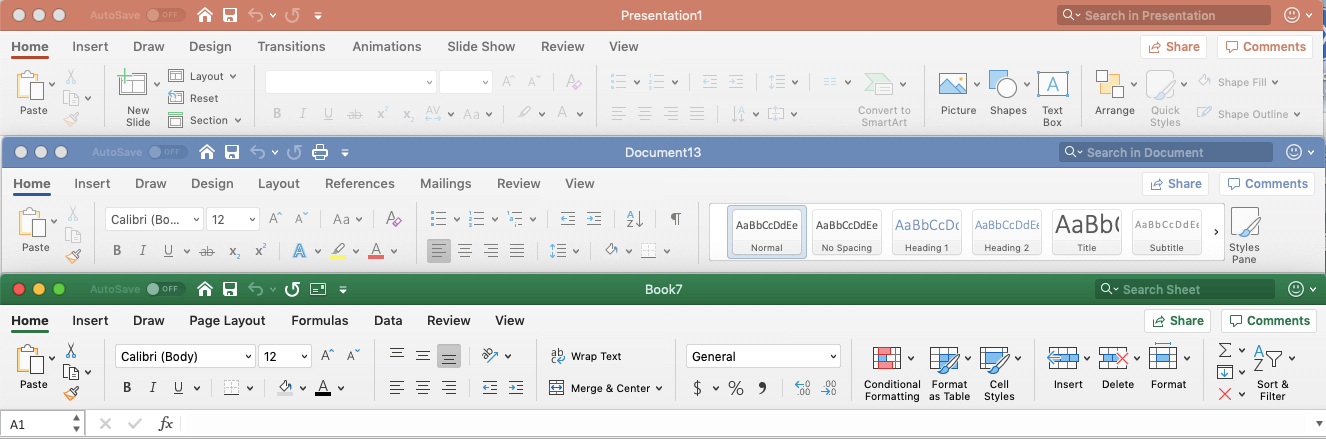
4. Consistency & standards
Screen elements should be consistent across the entire platform.
Microsoft’s header bars are identical for Word, Excel and Powerpoint so users can switch between the three applications seamlessly.
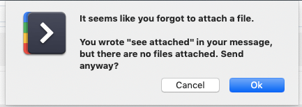
5. Error prevention
Errors should be kept to a minimum. You should try to prevent errors from happening by crafting careful design so users can’t break your system. In this example, Gmail tries to limit your errors. When you write “See Attached” in an email, Gmail checks if you have an attachment to make sure you didn’t forget to attach a document.
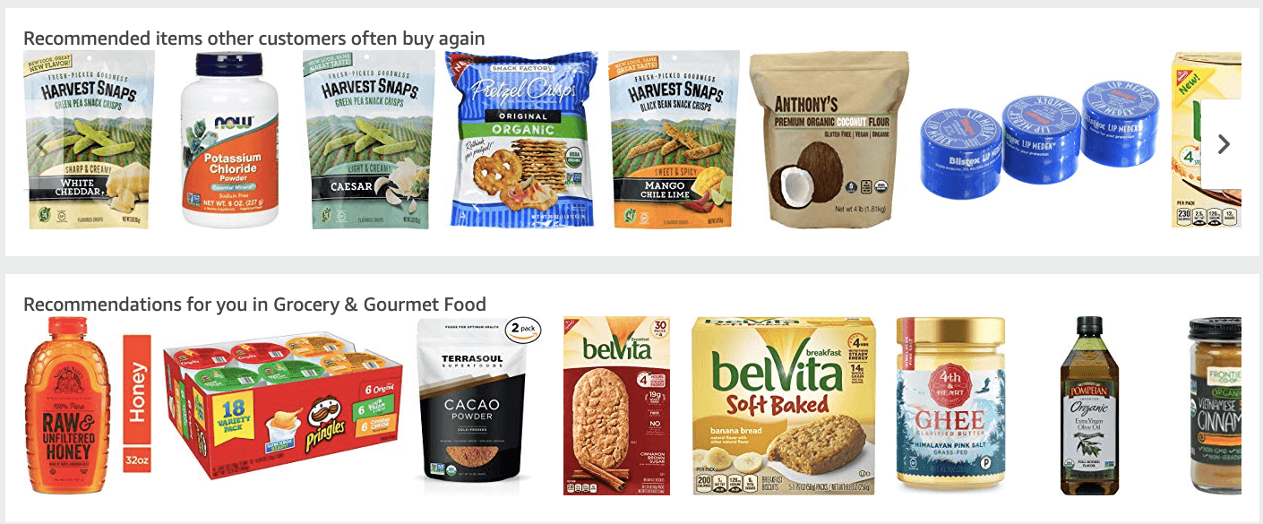
6. Recognition rather than recall
Minimize the user’s cognitive load by making information from one part of the website relevant to another part of the website.
When you visit Amazon, they include a list of your recently viewed items and they provide suggestions based on your past searches.
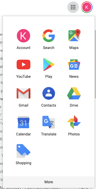
7. Flexibility and efficiency of use
- Shortcuts allow expert users to speed up the experience, while being unseen to the novice user. These shortcuts are important because your system should cater to all ranges of expertise.In this example, Google hides the the advanced features under “More” tab.
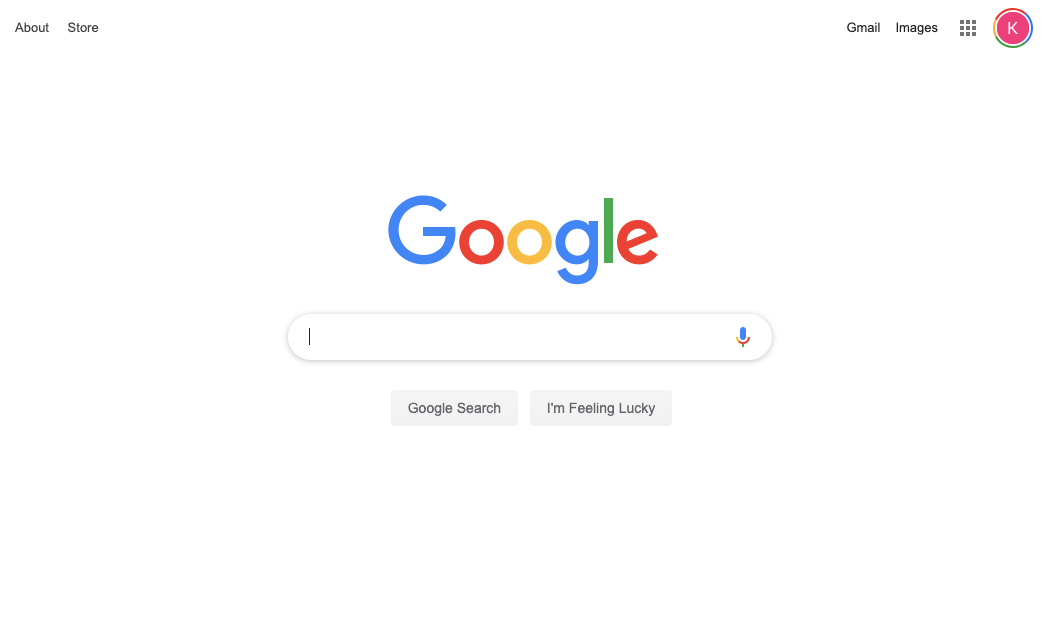
8. Aesthetic and minimalist design
Irrelevant information should not be included in your design. You should limit the design to must have elements only.
Googles landing page is very simplistic and easy to navigate.
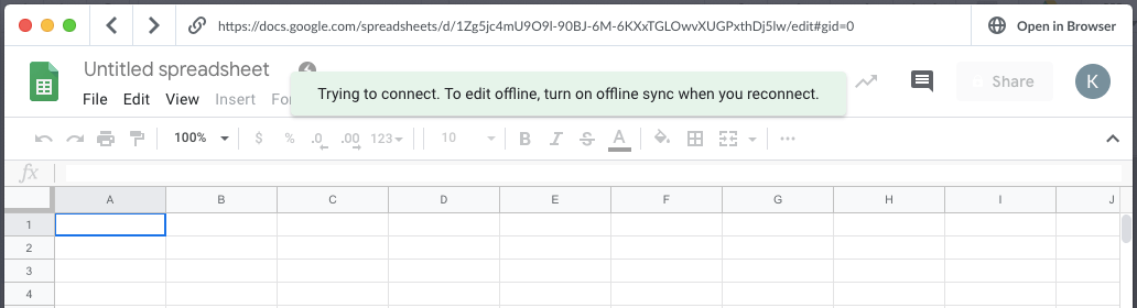
9. Help users recognize, diagnose and recover from errors
Error messages should use plain language, without codes. They should indicate the problem and suggest the solution.
Since I’m offline, Google Sheets lets me know that’s why I can’t edit my document and provides a solution to prevent this error in the future.
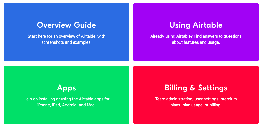
10. Help and documentation
Although the ideal system shouldn’t need documentation, there should still be documentation to provide the user with additional information.
Airtable provides customers access to documentation so they can find answers on the fly. At PlaybookUX, we list our help center as a tab of our product!
Try using heuristic evaluations to improve the usability of your products.
Start getting user feedback today